
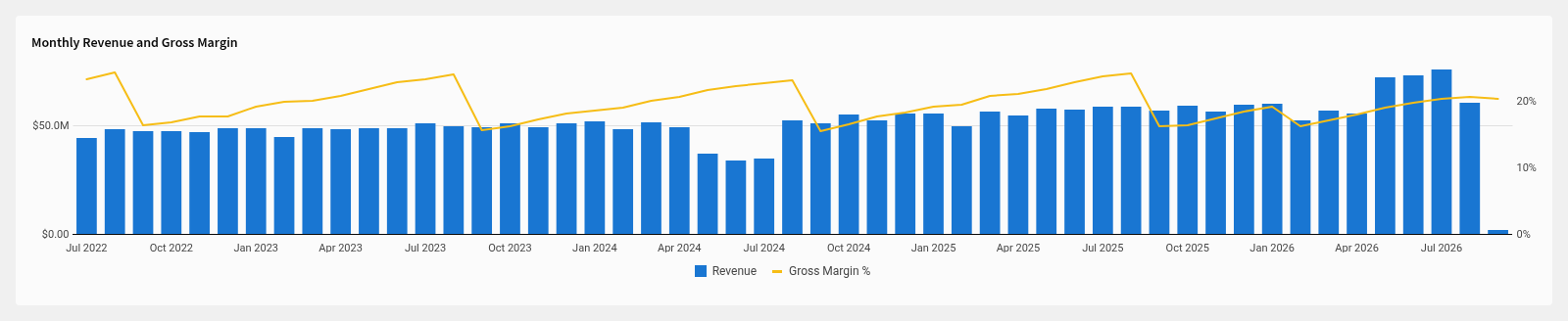
I needed revenue and margin on the same chart. Revenue is in millions, margin is a percent, and on one axis the margin line sits flat on zero.
Here's how to get bars for the total and a line for the rate, with the line on its own axis. I built it on Sigma's Plugs Electronics sample data so you can follow along if your org has the sample data connected.
What you need
A table with a date column and two measures. Here that's Date, Revenue (quantity times price) and COGS (quantity times cost). Margin gets calculated on the chart, not in the table.
Build it in the editor
Open the workbook in Edit mode. Click Add element, pick Charts, and choose the table as the source.
In the Chart property at the top of the editor panel, open the dropdown and pick Combo.
X-axis: click Add column and pick
Date. Hover the column name in the X-axis property, click the caret, hover Truncate date, pick Month. One bar per month.Y-axis: click Add calculation, pick Aggregate column, then pick
Revenue. Sigma sums it and draws it as bars. The first y-axis column on a combo chart is a bar by default.Y-axis again: click Add calculation, choose New column, and type the margin formula in the formula bar:
(Sum([Revenue]) - Sum([COGS])) / Sum([Revenue])Rename it
Gross Margin %. Every column after the first is drawn as a line by default, so this one is already a line.Put the line on its own axis. Hover
Gross Margin %in the Y-axis property, click the caret, hover Axis, pick Right. This is the step that fixes the flat line.Format the numbers. Caret on
Revenue, Format, compact currency. In the YAML that's$,.3s, and the axis reads$50.0M. Caret onGross Margin %, Format, percent with no decimals. The right axis picks up the percent format.
If you want a different shape for a series, the caret menu has Shape with Bar, Line, Area, and Point. Color by category only works on the bar series, not on lines.
The partial month at the end
The last bar in the screenshot is short because the data only runs a few days into that month. Any chart on live data gets a short last bar, and it misleads readers into thinking the month collapsed.
Fix it with a filter on the chart, not on the source table:
- Click the filter icon in the chart's toolbar, then Add filter, and pick
Date. - Choose a relative date range, for example the last 12 months.
- Turn off Include current month. The label names whatever period you picked.
If a date range control drives the chart instead, max:prior-month-1 in the control value ends the range at the last completed month. prior-month-0 is the current month.
If you build workbooks as code
Workbooks as code is a beta you have to ask Sigma to turn on; the endpoints below work once it's enabled.
This is the chart element only, trimmed to what matters. The full workbook document also holds the source table, and PUT /v2/workbooks/{id}/spec replaces the whole workbook document, not one element. The part that took me a while was yAxis2. The margin column id appears once inside yAxis.columnIds with type: line, and once again in yAxis2.columnIds to put it on the right axis.
- id: combo
  kind: combo-chart
  source: {elementId: sales, kind: table}
  columns:
  - id: c-month
    formula: DateTrunc("month", [Sales/Date])
    name: Month
    format: {kind: datetime, formatString: '%b %Y'}
  - id: c-rev
    formula: Sum([Sales/Revenue])
    name: Revenue
    format: {kind: number, formatString: '$,.3s'}
  - id: c-margin
    formula: (Sum([Sales/Revenue]) - Sum([Sales/COGS])) / Sum([Sales/Revenue])
    name: Gross Margin %
    format: {kind: number, formatString: ',.0%'}
  xAxis:
    columnId: c-month
    sort: {by: c-month, direction: ascending}
  yAxis:
    columnIds:
    - c-rev
    - {columnId: c-margin, type: line}
    format: {marks: grid}
  yAxis2:
    columnIds: [c-margin]
    format: {marks: none}
  name: {text: Monthly Revenue and Gross Margin, fontWeight: bold, fontSize: 14}
  legend: {position: bottom}
Push it with PUT /v2/workbooks/{id}/spec, or POST /v2/workbooks/spec for a new workbook, then export the page as PNG and look at it. I had a note from a few weeks ago saying the right axis couldn't be set from code. It can. I'd tried the wrong key names. In my builds the spec accepting the file has told me nothing about what the chart looks like, so render it every time.